The All-Neutral Room Is Not Automatically Calm
An all-neutral room can still feel restless. Learn how contrast, texture and variation shape a calmer palette, and what to adjust before adding color.
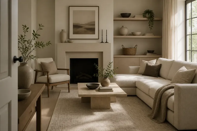
Why can an all-neutral room still feel busy or flat? A neutral room can lack visual calm when its surfaces, edges and repeated tones do not work together. Beige, gray, cream and white describe color choices; they do not decide how much attention a room demands. Look at contrast, texture and variation before assuming you need a new color.
Why can an all-neutral room feel restless?
Restlessness often comes from competing visual signals. A sharp black frame against pale walls, a high-contrast rug, glossy cabinet fronts and a scattering of small decorative objects can each draw the eye. Their colors may all be neutral, but their edges and finishes still compete.
A room can also feel unsettled when similar neutrals meet without a clear distinction. A warm ivory wall beside a nearly matching white curtain may appear mismatched rather than layered, especially where daylight changes the view. The issue is not that the colors are too warm or too cool; it is that the relationship between them is hard to read.
Try naming the first three things your eye lands on from the doorway. If they are unrelated details, the room may need a clearer visual hierarchy. You can reduce competing accents or give one surface a more distinct role, rather than adding color simply to make the palette feel intentional.
Does contrast matter if every color is neutral?
Yes. Contrast is the difference between neighboring elements, and it can come from light and dark, smooth and rough, large and small, or plain and patterned. A charcoal cushion on a pale sofa has strong value contrast. A nubby wool throw against smooth upholstery has texture contrast, even if both are close in tone.
Contrast helps objects and surfaces stay legible. When everything is equally pale and similarly smooth, a room can blur into one visual field. At the other extreme, many abrupt dark outlines or bold patterns can make the eye jump around. A calmer room usually gives contrast a few clear jobs instead of distributing it everywhere.
Stand at the entrance and notice where the strongest light-dark transitions occur. Ask whether they guide attention toward a useful feature, such as a fireplace or a framed print, or whether they appear on unrelated items across the room. Adjusting one competing contrast may have more effect than changing the wall color.
Can texture add interest without making the room busier?
It can, if textures differ in a restrained way. Linen, brushed cotton, matte ceramic, woven cane and unfinished-looking wood each catch light differently. That variation gives a neutral palette depth without requiring a new hue or a bold pattern.
Texture becomes visual clutter when too many small, highly distinct surfaces gather together. A rough basket, ribbed vase, fringed cushion and heavily patterned throw may all be attractive alone, yet their details can compete when clustered. Balance intricate surfaces with quieter ones, such as a plain cotton curtain or a simple painted wall.
Think about texture at the scale of the room as well as the object. A broad wool rug reads as one soft field from across the room; a small, intricate weave may read as busy up close. Choose some surfaces for their overall presence and others for the detail they reveal when you come nearer.
How much variation keeps neutral colors from looking flat?
Variation means giving the eye related differences to notice. It may come from a change in tone, material, pattern scale or finish. A room of creams and taupes can feel layered when a matte wall, a softly patterned rug and a darker wood surface each have a distinct role.
But variation is not the same as collecting every available shade of beige. Too many near-matches can make the room look accidental, particularly when they meet in a small area. Let a few tones repeat so the room feels connected, then use one or two more distinct values or textures to prevent the surfaces from merging.
Say you have an ivory sofa, pale walls and a cream rug that seem to disappear together. Imagine replacing one cushion with a deeper taupe, adding a textured throw, and leaving the rug and wall unchanged. The expected visible result is a clearer outline around the seating area, with the shared palette still intact.
What questions help diagnose a neutral room?
Why does my beige room look different from one corner to another?
Daylight, lamps and nearby materials affect how beige is perceived, so the same wall can appear more muted or more golden as the light shifts. Compare the surfaces at different times and notice whether the change feels pleasing or makes adjacent neutrals seem unrelated.
Should I add a dark accent to a pale neutral room?
A dark accent can clarify the room’s visual structure, but it does not have to appear in many places. Try considering one substantial element, such as a frame or a cushion, and judge whether it gives the eye a useful anchor or becomes another competing focal point.
Can a patterned neutral rug make a room feel calmer?
It can, if its pattern has a readable scale and does not compete with several other busy surfaces. A subtle, broad pattern may unify nearby furniture, while many small sharp motifs can draw attention across the floor.
How do I know whether a neutral finish is too glossy?
Notice whether reflections pull your attention toward the surface or make nearby objects harder to distinguish. If the sheen feels distracting, compare it with a matte or softly textured finish in a small area before deciding to change more.
What should you adjust first?
Make one visual change at a time, then look at the room from the same doorway. Start with the element that seems to compete most, not with the easiest color to buy. Use this short review to decide what to try:
- Check the strongest light-dark contrast. If it pulls attention from the room’s main feature, soften or relocate one accent.
- Look for nearly matching surfaces. If they seem unintentionally mismatched, create a clearer difference in tone or texture.
- Count the busy surfaces in one view. If several patterns or intricate textures cluster together, quiet one of them.
- Notice where finishes repeat. If every surface is glossy or every fabric is smooth, introduce a contrasting finish in a limited area.
- Check whether a tone appears more than once. If an accent feels isolated, repeat it subtly elsewhere or remove it.
These checks are about visual relationships, not a fixed formula for a restful room. The all-neutral room becomes calmer when its differences feel deliberate: contrast directs attention, texture gives surfaces character, and variation keeps similar colors from disappearing into one another. Before reaching for a paint sample, identify which relationship is making the room feel unsettled and adjust that one first.