Oak, Ash or Beech? Reading Wood Grain in a Room
Compare oak, ash and beech wood grain by color, line and visual weight, then choose a finish that fits your room and nearby materials.
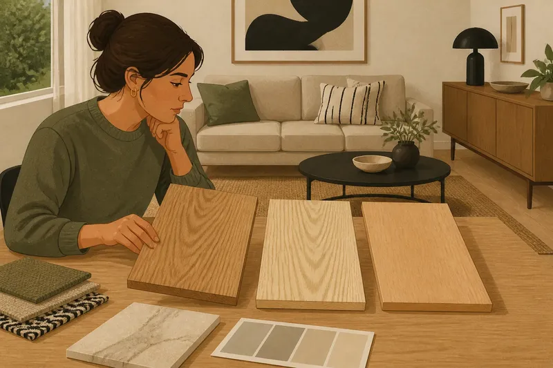
Oak, ash or beech wood grain can change how a floor, cabinet or table reads beside the materials already in your room. Before choosing a sample, look at the grain’s line, contrast and visual weight—not just the wood’s color name. A pale board can look quiet or busy, depending on its markings and what sits next to it.
Use the week before ordering to assess the room in its real light and compare samples against actual finishes. The aim is not to match every surface. It is to choose a grain whose character supports the room rather than competing with its strongest details.
What does each wood grain look like?
Oak usually has a clearly legible grain. Its lines can be straight or gently curved, with prominent pores and, depending on the cut, broad, flame-like markings. That definition gives oak a substantial, textured presence. In a matte finish, the grain often remains the main visual feature; a stronger sheen can make it catch the light more conspicuously.
Ash tends to show long, open, sweeping lines. The contrast between its lighter and darker areas can make the pattern feel lively, even when the board’s overall color is pale. Ash suits a room where a visible directional grain is welcome, but its pronounced movement may draw attention beside other strongly patterned materials.
Beech generally has a finer, more even appearance. Its grain is less likely to announce itself with large, dramatic markings, so it can read as comparatively calm. The color may lean warm or pinkish, and subtle flecks or small marks can still be visible. “Quiet” does not mean featureless: the board’s tone and finish remain part of the room’s palette.
These are useful tendencies, not promises about every piece. Grain varies with the tree, how the timber is cut, how boards are assembled, and the finish applied. A product described as oak or ash does not tell you exactly how pronounced its markings will look in your home.
Which visual quality matters most in your room?
Start by choosing the quality you want the wood to contribute. You might want a surface that acts as a clear natural feature, one with a flowing sense of movement, or one that sits quietly beside more noticeable room details. Those preferences are more useful than trying to name a style and hoping the timber fits it.
- Choose oak for defined texture. Its visible pores and varied markings can add depth beside plain plaster, simple upholstery or smooth painted cabinetry. If the room already has heavily figured stone or pronounced wood elsewhere, the extra grain may create competition.
- Choose ash for sweeping movement. Its long lines can make a board feel expressive and directional. Consider how that movement will read alongside striped fabrics, strong veining or other linear patterns.
- Choose beech for a finer pattern. Its more even grain can leave room for a prominent rug, colorful furniture or intricate hardware to lead. Check the undertone carefully so the wood’s warmth works with nearby whites and grays.
Then inspect the room’s existing visual weight. A large, dark, heavily figured surface tends to command attention; a pale, fine-grained surface can feel less assertive. That is a visual relationship, not a claim that one species physically weighs more. Think about what you want a person to notice first when entering the room.
How should you compare samples over a week?
A short comparison routine helps separate a sample’s lasting character from the first impression it makes under showroom lighting. Keep the samples in the room where the wood will be used, and place them against the materials they must live beside.
- On the first day, gather the room’s reference materials. Set out a paint card, a fabric swatch, a tile or stone sample, and any existing wood finish that will remain. Photograph the group in place so you can refer to the actual surroundings when viewing alternatives.
- On the second day, choose samples by grain character. Ask for oak, ash and beech pieces with finishes close to the intended product. If you are choosing flooring, use boards or larger samples when available; a tiny chip may not show the full direction or variation of the grain.
- On the third day, compare tone in daylight. Lay each sample beside the reference materials, then view it near a window and farther into the room. Notice whether it looks yellow, pink, gray or neutral, and whether the grain becomes more prominent against the floor or wall color.
- On the fourth day, check it under the room’s usual lamps. Warm and cool bulbs can shift how wood and neighboring paint appear. Look at the same samples after dark, with the lighting you expect to use, rather than judging them only in daylight.
- On the fifth day, change the neighboring material. Place each wood sample against the actual upholstery, rug or counter finish most likely to sit beside it. A grain that looked balanced against a plain card may feel busier beside a patterned textile.
- On the sixth day, check the whole composition. Stand back and view the sample with the larger room elements in sight. Decide whether the wood adds the right amount of definition, movement or visual quiet.
- On the seventh day, make a short written choice. Record the species, finish, preferred sample and one reason it suits the room. If two options remain close, keep the decision focused on their visible difference rather than adding more unrelated samples.
For a floor or a run of cabinetry, ask the supplier for samples that represent the product’s expected range of color and grain. A single board can be unusually plain or unusually marked. Product descriptions and manufacturer guidance should inform finish and care choices, while the room comparison helps you judge appearance.
What happens when grain meets nearby materials?
Wood does not appear in isolation. A visible grain sits against wall color, textiles, stone, metal and other timber. The useful question is not whether everything matches, but whether the different surfaces share a workable balance of tone and pattern.
With veined stone, start by identifying which surface should carry the strongest pattern. If the stone has dramatic lines, finer-grained beech may leave it more room to stand out. If both surfaces are modestly marked, oak or ash may add welcome texture. This is a visual choice, so compare the actual samples rather than relying on species names alone.
With painted cabinetry or plain walls, a more pronounced grain can provide useful variation. Oak can bring clear texture, while ash contributes a long, flowing pattern. Beech may be a better fit if the room already has a focal fabric or a collection of objects with varied shapes and colors.
When two wood finishes appear together, compare their undertones as well as their grain. A warm beech surface beside a cooler gray-toned oak may look deliberately varied, or it may feel disconnected; the surrounding paint and textiles influence that reading. Repeating one exact finish is not the only way to make two woods feel related. A shared warmth, similar grain scale or clear difference in visual role can also help.
What should you check before choosing?
Does oak grain always look bold?
No. Oak can vary from relatively restrained to strongly marked, and the cut and finish affect what you see. Judge the actual sample for pore visibility, contrast and pattern rather than assuming every oak surface has the same character.
Is ash always lighter than oak?
Ash is often associated with a pale appearance, but color depends on the particular timber and its finish. Compare the sample with your wall and floor materials in both daylight and lamplight instead of treating the species name as a color specification.
Is beech too plain for a feature surface?
Not necessarily. Its grain may be finer than oak’s or ash’s, but a large area, warm tone or reflective finish can still make it noticeable. Consider how the complete surface reads at a distance, not only the detail on a small sample.
Can I choose from a small sample chip?
A chip helps with initial tone, but it may not show the grain’s full movement or the variation across boards. For a large surface, request a larger sample or product information that shows a representative range before making a final appearance choice.
How do you settle a close choice?
Imagine you are choosing a dining table for a room with a veined stone counter, plain painted walls and a patterned rug. You place oak, ash and beech samples beside all three materials during the week. The oak’s texture seems to compete with the stone, while the ash’s sweeping lines pull attention from the rug; the beech sample looks more settled beside both. You would then choose beech for its quieter grain, provided its undertone still works with the room’s paint and other wood.
That decision is not a rule that beech belongs with patterned rooms. It shows how to let the actual relationships decide: grain against grain, warm against cool, and prominent against restrained. If the preferred wood changes character under your lamps or against a larger sample, revise the choice before ordering.
For a final comparison, place the leading sample beside the room’s largest nearby material and view both from the doorway. Oak, ash or beech wood grain is easiest to choose when you can see its pattern at the same scale and from the same distance as the surfaces it will accompany. Keep the sample that contributes the character you want without asking the rest of the room to disappear.